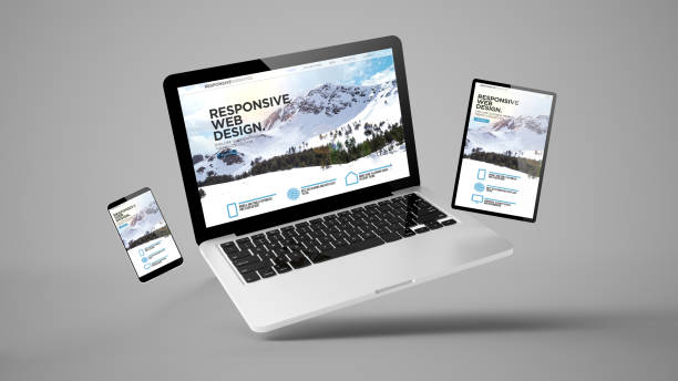
Responsive web design (RWD) is a development approach that creates dynamic websites tailored to provide optimal viewing and interaction experiences across all devices – from desktop monitors to mobile phones. With mobile internet usage now exceeding desktop, responsive design is critical for modern websites to deliver quality user experiences. In this post, we’ll look at the role of responsive web design, techniques for implementation, and why it should be a top priority for companies wanting to drive engagement, conversions, and revenue growth.
What is Responsive Web Design?
Responsive web design involves using flexible layouts, CSS media queries, and fluid images/videos to detect a user’s device screen size and orientation. Based on screen parameters, the website seamlessly adapts and renders the optimal site layout, content organization, navigation, and media for that viewport. This provides mobile users a streamlined experience equivalent to that on desktop. RWD replaces having a separate mobile website, though responsive design now benefits larger desktop views too.
Benefits of Responsive Design
There are several compelling reasons making RWD essential:
Enhanced User Experience
By optimizing content layout and navigation for the screen size, users enjoy seamless browsing. This enhances engagement across devices.
Increased Conversions
Smooth, user-friendly experiences on mobile and tablets increases conversions for ecommerce sites, lead generation, and calls-to-action.
Lower Bounce Rates
Adaptivity reduces frustration from pinching/zooming small text. This lowers bounce rates and draws visitors deeper into site content.
Better Search Engine Optimization
Responsive sites allow Google to crawl mobile content more efficiently. This improves SEO as Google favors mobile-friendly sites.
Reduced Costs
Responsive design means only one site version to develop and maintain versus separate desktop and mobile sites.
Future-Proofing
As new devices emerge, responsive sites easily adapt without needing redesigns. RWD offers long-term flexibility.
Clearly, responsiveness provides user experience and commercial advantages that make it a smart investment.
Implementing Responsive Design
While each site is unique, there are best practices for technically executing responsive web design:
- Use a mobile-first approach to information architecture and content hierarchy.
- Design with scalable grid layouts and flexible images from the start.
- Leverage CSS media queries that adapt styling based on parameters like screen width.
- Employ fluid content containers that resize smoothly rather than fixed pixels.
- Test the responsive experience on all current device sizes and browsers.
- Include meta tags for optimal display on mobile browsers.
- Keep performance optimized, like compressing images, to avoid sluggish mobile load times.
RWD takes planning, but modern web design tools make implementation easier than ever. The user benefits make it well worth the effort for designers and developers.
Responsive Design is Now Essential
With Google planning to roll out mobile-first indexing in 2021, responsive web development is truly mandatory for any brand’s website hoping to compete and satisfy customers in the digital landscape. Partnering with experienced responsive web design and digital marketing professionals ensures your company can cost-effectively adapt and continue driving results through fluid site experiences tailored to any device. The time is now to invest in responsive design.


